If you’re planning to create a new grid website, or redesign an old one, a great place to start is WordPress themes.
WordPress is a popular blogging platform, so it’s easy to update. You can create accounts for all your grid administrators and volunteers so that they can upload new photos, event announcements, and grid news.
WordPress also supports sidebar widgets, which means you can easily add in social media functionality without having to redo your whole site every time a hot new social media platform comes along.
WordPress is free, and many themes are free, and pretty much every developer out there knows it inside out, making it easy to get custom work done. The “free” part just applies to the software, of course. You still need to get web hosting (I use Dreamhost and like them because they have the best usability) and install everything and keep it upgraded. Expect to pay around $100 a year for website hosting — scroll down to the bottom of the article for some advice on how to set up a site for at no cost at all.
If someone is trying to talk you out of WordPress it’s probably because they’re trying to upsell you to a fancier but less functional platform, where you’re locked in, where you’ll have a hard time finding other developers to work on it, and will need to hire the original designer every time you make even the most minor change.
Hypergrid Business is a WordPress site based on a free template that I customized by hand. My hosting company, Dreamhost, has a very easy one-click WordPress install that does everything for me. All I have to do is log in and choose a theme and I can have a website up in a few minutes. If I was setting up a new website for a grid, I would do just that — and then link to the WiFi web interface page for the stats and to create new accounts. Someone with more skill than I could integrate the two so that it was all part of the same site, of course. Dreamhost offers unlimited sites for that $100 (or so) a year, so if I have a lot of low-traffic grids, I can set up a separate site for each of them at no extra cost.
In addition to free WordPress themes, you can also get commercial ones, which typically range between $39 and $59 for simple sites. The commercial themes typically offer more built-in customization options, are regularly upgraded, and come with support.
The following are some nice WordPress themes that I think would make for great grid websites.
zAlive
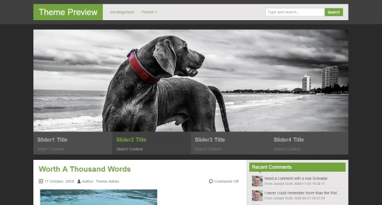
Just upload your own grid’s logo, change the accent color from green to whatever the accent color of your grid is, and find some really great images to illustrate life on your grid. I would also add in four buttons below the graphics and above the latest news posts, FrancoGrid-style, for creating a new account, signing up for a newsletter, Twitter, or Facebook page, renting land, and viewing the events calendar. Or whatever the top four actions would be relevant for my grid.
Then I’d stick all the detailed stuff — stats pages, about us, contacts, DMCA, TOS and so on — up in the drop-down menus.
Since this grid has a dark background, I’d use it for science fiction-themed grids, racing grids, or other grids designed to appeal to young men.
Best of all, zAlive is available right from WordPress.org, meaning you can install it right from your site’s Appearance tab, without having to download or upload any files. Just go to Appearance>Themes, click on the “Install Themes” tab and search for “zAlive.” Or go to the download page here and the preview page here.
If you’re on the WordPress.org site, or in the “Install Themes” tab, you can also search for similar themes by using the keywords “business” or “magazine” or “photo.”
Prospect
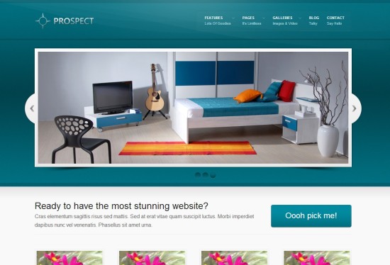
I like this theme for its crisp, clean style. I can see it working well for a school or company grid. Or, with a different color background, for any kind of social grid. I particularly like its built-in gallery pages, which can be used to showcase regions or events.
The image slider is a bit smaller than in the previous theme. But that might actually be a good thing if, say, your snapshots aren’t exactly museum quality.
Download the theme here for free in return for signing up for their free newsletter. Preview the theme here.
Adapt
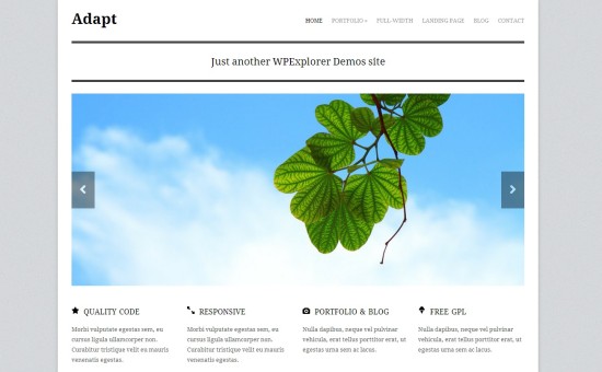
This theme has it all. A nice big featured image slider to showcase your best snapshots, four highlight areas right below for your “Register now”, “Rent a region” and other key links, a little photo gallery right below that for feature destinations or upcoming events, and finally a news section.
It comes with a built-in drag-and-drop home page designer, making it easy to arrange these elements just the way you like them, with no programming required. Plus, the theme is responsive out of the box, which means it automatically resizes itself and rearranges columns and menus to fit on any sized screen, including phones and tablets.
It’s all very nice, slick and professional looking. And, since all the basic theme elements are just black and white, nothing will clash with your grid’s logo, or the images you decide to feature.
Download the theme here after registering for a free account, or buy the theme for $25 and get support for the theme. Preview the theme here.
Wide photo
If you like the home page for the Lost Castle grid, this theme is a great option. The background image of this theme is actually a slider, which you can use to showcase the snapshots from your grid.
The black menu tab can bring up a pop-up menu for any of the items on it, so you can actually put quite a few links in that small space.
Use this to showcase an artistic personal grid, or a group-owned role playing grid.
Download the theme here for $39. See the theme demo here.
Autochrome
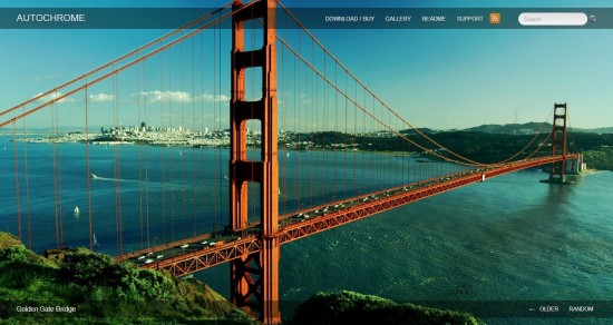
Another full-screen photo theme, this one comes with a more standard menu bar across the top. Unlike with the Wide Photo theme, however, the images don’t cycle through automatically — visitors have to click a button at bottom right.
In addition, interior pages have white text on a black background so don’t expect to be posting a lot of text-heavy articles — or, if you do, I recommend that you reverse the colors so that it’s easier to read.
You can download the theme for free or get a supported, maintained version for $34.45. Check out the demo here.
Panoramica
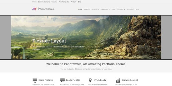
This theme reminds me a bit of the Adapt theme. Large image slider, drop-down menus, four action buttons right under the slider, and a small photo gallery on the bottom of the home page for featured locations or events.
And, like most new themes, it’s responsive, so it will work well on tablets and smartphones.
Download the theme here by creating a free account, or buy Panoramica Pro for $60 and get more customization features and support. Try a demo of the theme here.
Orion
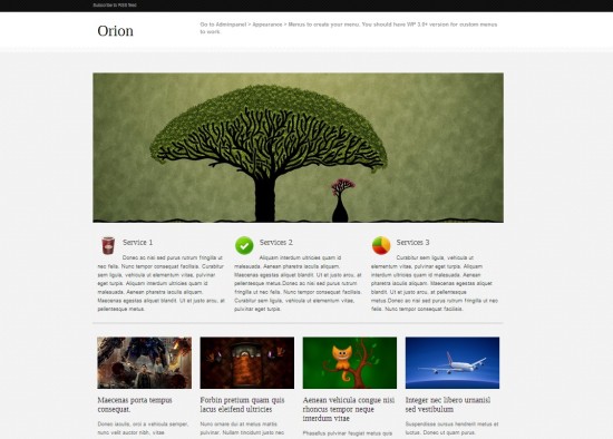
This theme is just adorable, but maybe it only looks that way because of the demo images they picked. There’s a nice image slider for snapshots, three call-to-actions right below the slider, and spots you can use for featured locations or events below that.
It’s responsive, so it resizes well.
Download the theme here for free, or check out the demo.
Yasmin
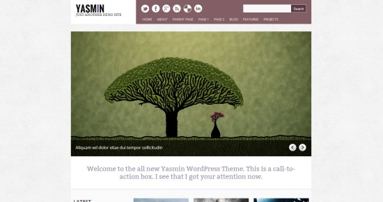
This is another theme from the same folks who did Orion, and offers many of the same features, except with a different look and feel. The three call-to-action boxes are replaced with a single call to action right below the main image slider, which is a little bigger and better proportioned for snapshots.
Download the theme here for free, or explore the demo.
Intuition
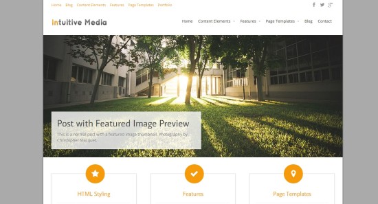
Another clean, simple responsive theme from the same folks who brought you Panoramica. Nice image slider, drop-down menus, three call-to-action boxes.
Install the free version of the theme directly from within your WordPress installation, or download it here. Or, for $60 a year, get support and access to more than a dozen gorgeous themes. See the Intuition demo here.
Website checklist
- If you’re selling anything through the website, such as regions, virtual currency, or virtual content, make sure there are as few hoops to jump through as possible before the customer sends you money. They should only be asked to make the minimum decisions necessary to determine price and have just enough information to make a purchasing decision. Everything else — region names, avatar credentials, technical details — can come later. Each time you ask them a question they don’t know how to answer — “What coordinates do you want for your new region?” — is an opportunity for the customer to to say “I’ll do this later.” And, of course, later never comes.
- Also, if you accept money on your site, make sure that the developer is someone who’s done e-commerce sites before. This is not something you want an amateur messing around with. If you can’t afford a developer, link to a ready-made shopping system like Tictail, which starts with a free plan, Shopify, which starts at $15 a month, or Miduu, which starts at $8 a month. Or, if you’re processing orders manually — which is the case for most startup grids — you can simply use a standard PayPal payment form on your website, then have PayPal forward the purchase information to the person responsible for taking care of it.
- If you’re using a third-party developer to create a site, make sure that you own the domain, the hosting, and hold all the administration account passwords. Create new accounts for each individual developer — that way, you can delete the account when the relationship ends, at no risk to the site itself. If the developer is setting all this up for you, have them walk you through the process, and then turn over all credentials to you so you can then go in and change the passwords. Good developers won’t mind. Bad developers will raise a fuss and make up excuses for why they need to keep the passwords — and you’ll know to stay away from them.
- If you’re hiring someone to overhaul an existing site, pay extra if you have to to have them do the initial work on a testing server, and only upload it to the live site when you’re happy with it. And, before uploading, have them make a full and complete backup of your existing site for you.
- If you’re running a commercial grid, put up “About Us” and “Contact Us” pages with real information. If people are paying you real money, they deserve to know who you really are.
- Include a link to a Terms of Service either in the header or the footer, so folks looking for it can find it from the home page. Also include a link to your content infringement takedown page. Kitely has a particularly nice one.
- Check for dead links and filler text. Many themes come with a few default pages with nothing on them. Either fill in the information, set those pages to “draft” mode to finish later, or remove them from your site.
- If you want people to visit, make sure your loginURI or your hypergrid address is easy to find. I don’t recommend creating a custom viewer and forcing all your users to use it because it will deter people from visiting. How many custom viewers can one person have, anyway? The main exceptions are school sites, where you don’t want kids to have easy access to other grids.
Totally free hosting
What about if you’re looking for a completely free website? Maybe your grid is a small school or non-profit grid, and you don’t have $100 (more or less) a year to spend on hosting. Or maybe you have a personal grid and you want a nice-looking page but don’t want to spend any money.
There are lots of free blogging sites out there, such as Weebly, Blogger, and Ghost, but if you’re going to go with one, I’d recommend WordPress.com, the commercial version of the free WordPress platform. It’s reputable, reliable, and it’s easy to upgrade to a regular WordPress site once you’re ready to make the move.
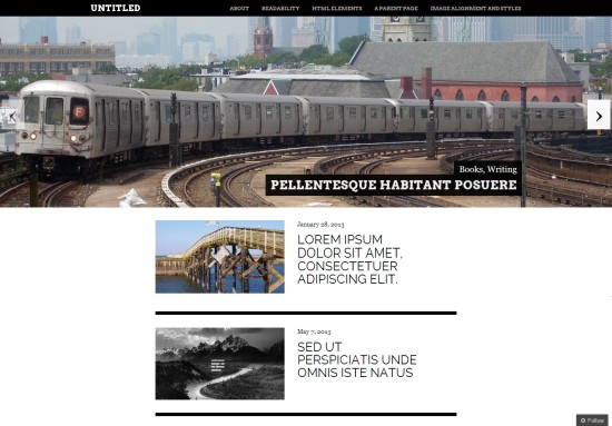
The above free WordPress.com theme, for example, includes a nice large image slider to showcase your grid’s snapshots, an easy-to-use drop-down menu in the top bar, and then you can add your news announcements and featured events in the blog posts below.
If you do use a free blogging platform to host your site, however, I strongly recommend that you invest $10 and register your grid’s domain name. If your blogging platform doesn’t allow you to use custom domain names without an addition fee, simply have your domain name registrar forward your visitors to your free site. Then, if you do switch hosting, just forward your domain to the new destination.
It’s just $10. You can afford it.
- Analysts predict drop in headset sales this year - March 25, 2025
- OSgrid enters immediate long-term maintenance - March 5, 2025
- OSgrid wiping its database on March 21: You have five weeks to save your stuff - February 15, 2025

