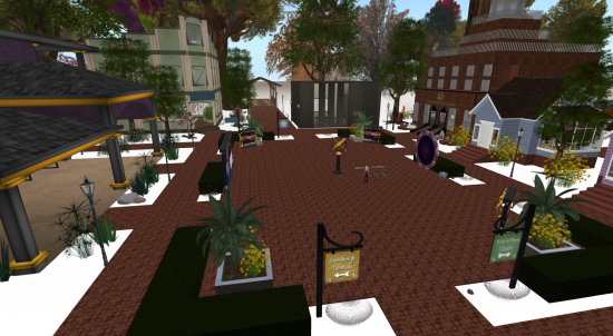
With some help from scripters, designers, and other hypergrid travelers, we’ve been bringing the Hyperica directory up-to-date.
As part of the process, I travel to a lot of grid welcome regions — there are about forty grids that are on the hypergrid that are already in the directory, and we’re coming across more new grids all the time.
Overall, the quality of the welcome regions has improved significantly over the past couple of years, as grid owners have had time to build nice regions.
Plus, the wide availability of free, CC-licensed content from creators like Linda Kellie makes it easy for a grid to quickly create a pleasant welcome region with fully stocked freebie stores.
What is a welcome region?
A welcome region is the region visitors go to when they log in for the first time, or teleport to the grid’s hypergrid address without providing a region name.
For example, hg.osgrid.80 goes to LBSA Plaza, yoursimspot.com:9000 goes to the YourSimSpot region, virtyou.com:11002 goes to the NineSim region.
If you don’t know what your welcome region is, check with your hosting provider or try to teleport in from another grid.
This is the 3D equivalent of your website’s home page. It is the first impression your visitors have of your grid. Make it count.
Here is a checklist of some must-have items for any welcome region.
1. Attractive landing point
When people teleport in for the first time, they’ll typically land at ground level in the exact center of the region.
This landing point should look out on the best view you’ve got. Not at the underside of a wood floor, or an empty dungeon basement, or the bottom of a lake. Okay, okay, there are grids that can make any of those work.
But, for the most part, underwater landings are accidental — the region’s designers forgot that first-time visitors won’t have landmarks saved that take them straight to their favorite locations.
It can be extremely difficult for a new visitor to figure out how to get out of a dungeon, or out of lake — especially if the designers have put structures on top of the landing point that make exiting impossible.
So make sure you teleport in and out of your welcome region, so you know where visitors land, keeping in mind that setting a different landing point for your region may not always work. Err on the safe side.
The visitors’ first view of your grid should be welcoming yet informative. There should be enough stuff there for them to know what to do, but not so much stuff that they get overwhelmed — or get tired of waiting for it to load.
2. Navigation
Visitors want to explore your grid. Make it easy for them. Put up attractive signs to other regions on the grid. These could be in the form of a teleportation board, or a single animated sign that shows a rotating gallery of the grid’s top destinations.
Think of it as the 3D equivalent of your website’s navigation menu. It should be obvious, useful, and in a logical location.
Be careful to differentiate destinations that are on the same region, on other regions of your grid, or on other grids. One possible way to do this is to use hypergates for travel to other grids, a teleportation board for travel to other regions, and street signs for teleports to your welcome region’s local freebie shop, meeting area, or land rental offices.
People tend to be more willing to do local teleports, to save themselves the trouble of walking from place to place. Once they’ve explored the welcome region, they may want to visit some of the other regions on your grid. Once they’re done, they’ll want to go on to other grids.
To make it easy for your visitors to get back to your welcome region give them a landmark, or put up signs on the other regions of your grid that take them back to the welcome region — the way that a “Home” button on a website always takes you back to the home page.
3. Freebies
Almost every grid has some freebies in its welcome region. Some go overboard, providing fully-stocked freebie stores that take a long time to load. Others go the minimalist route, putting out a single box filled with starter clothing and accessories.
A middle-of-the-road approach would be to offer a selection of starting avatars for people who created new accounts on the grid. One click, and your avatar now looks like the avatar in the picture. A large freebie store can be overwhelming to a newbie who may not yet know the way around their inventory or hasn’t yet learned how to unpack objects.
For hypergrid visitors, offer them souvenirs that are unique to your grid, such as T-shirts with your grid’s logo on them. You can also use the welcome region to showcase unique freebies from your grid’s top designers — with teleport links to their full stores for those who are inspired to see more.

4. Meeting area
Take a cue from OSGrid’s LBSA Plaza and make your welcome area a popular gathering spot for residents. That way, when newbies log in for the first time, or hypergrid visitors teleport in, they will see a popular, busy area and have a good impression of the grid. Plus, there will be folks around to answer questions about the grid.
Encourage folks to hang out by creating a pleasant outdoor cafe within eyeshot of the landing point, install a sitting area around a campfire, or create an overlook to a particularly inspiring scenic view.
Make sure there’s nothing that blocks the view of the people from the landing point — no trees, signs, walls, or buildings. Not everyone knows how to use a mini-map and even folks who do will often mistakenly assume that a region is empty simply because there’s no one else immediately visible.
Try and schedule at least one mentor or greeter to be around at all times — or, at least, during the popular hours for your grid. Encourage greeters to make friends with visitors — they can even make friends with folks who come in over the hypergrid — and to offer a tour of some popular grid destinations.
5. Calendar of events
Another way to demonstrate that a particular grid is busy is to post an up-to-date calendar of events. If possible, include teleport links to the events that are coming up, and offer landmarks to events that are scheduled for the future. Allow visitors to sign up for event announcements.
Now that OpenSim supports hypergrid messaging, you can let people know about happenings even if they are somewhere else out in the bigger metaverse.
6. Land rental office
Most grids offer land rentals in some form or other. Make it easy for new residents — and visitors — to give you money by putting  a land rental office on your welcome region.
If your grid only allows third-party connections, put up instructions for how people can connect their home-based regions, or which vendors offer land on your grid.
The land rental office could be a simple sign that hands out notecards, or it could be a building people can visit to find out about latest land deals, residential communities, or get tours of available properties.
A land rental office could also offer land management tools, such as allowing avatars to pay their rent, see their regions’ visitor logs and other information, request OAR uploads or downloads, or move or restart regions.
7. Keep it PG-rated
It’s never a good idea to impose nudity on your visitors when they don’t expect it. Someone might be bringing a potential corporate customer to your grid, for example — seeing full-frontal male avatar nudity in the freebie shop will leave the visitors with a bad impression of the grid.
Similarly, when you create a teleportation board to showcase the other regions on your grid, indicate if the regions are meant for adults.
Some visitors will immediately head for the adult areas, while others will immediately avoid them. Either way, they’ll know what to expect.
You can put up disclaimer text on the signs going to the adult regions: “By clicking this teleport button you affirm that you are over 18.” Or you can take it one step further and make the mature limits off-limits to everyone but age-verified local grid residents.
8. Get rid of the construction
With so many great pre-made regions now available, there’s no reason for new visitors to arrive at a construction site. Use one of the existing OARs for a temporary welcome region. Then build elsewhere, and move your finished objects — or even the entire finished region — to the welcome area when you are done.
9. Give folks a path to follow
Just like supermarkets carefully design the routes that prospective shoppers will take, you can design a route for visitors to take that shows off your welcome region to maximum advantage.
Then walk the route yourself to make sure that it’s natural to follow, and takes visitors to the destinations they most want to visit.
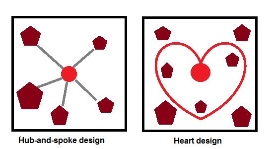
Two common approaches for regions are the hub-and-spoke and the heart shape.
With the hub and spoke, visitors land in the center, then can head off in a number of different directions — one way to the freebie store, another way to grid’s central gather area, another way to the land office, another way for the gallery of destinations and gates to other grids.
Visitors can find their way back to the hub by walking back on the paths they came down, or by clicking on teleporter signs.
A heart-shaped path gives folks two exits out of the landing area, that loop around. Most folks will go left, and follow the path around to the beginning.

The hub-and-spoke design is the most popular out there — second only to the “put things in random places and then have your visitors try to find them” option. Straight paths make it easy to see the destinations, and you’ll be sure that your visitors will never get lost.
If using the heart design, make sure that the default landing spot is designed to make it easy to find the start of the path. Encourage visitors to follow the paths by putting up street signs such as “This way to the freebie store.” Make it easy for people to find their way back with teleport signs.

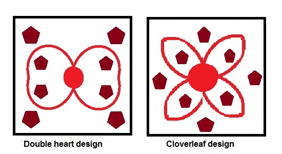
Other options include two or four looping paths that take your visitors on a tour of the region. The more loops, the more clear signs need to be, as visitors can easily get turned around and forget the way to the center.
Stay away from grid layouts. Grids — like city streets — are easiest to navigate in real life when roads are perfectly straight and there are lots of four-way intersections. But grids are difficult to use in virtual worlds because every square in a grid is equal — making it hard to tell which destinations are most important. Real life cities put their tallest buildings in the center — but in virtual worlds, this hurts sight lines and makes flying difficult.
Whatever the layout, remember that all buildings need multiple points of entry — not just on the side the path leads to. Some visitors will prefer to fly over the region, or will try to take shortcuts, cutting across between paths. Some designers leave off the roofs on their buildings unless absolutely necessary, or putting in partial roofs, in order to allow visitors to land from the air.
If you have landscaping lining your paths, keep it phantom so visitors don’t get tangled up in the branches. If you have bridges over water — or any kinds of stairs — line them with transparent walls to keep your visitors from falling off the strairs or into the water.
10. Keep it fresh
Make people want to come back by changing things up on a regular basis.
Change the landscaping to make the seasons. Change the upcoming events calendar. Change the selection of starting avatars and souvenir freebies.
- OSgrid back online after extended maintenance - April 16, 2025
- Analysts predict drop in headset sales this year - March 25, 2025
- OSgrid enters immediate long-term maintenance - March 5, 2025
