Here at Hypergrid Business we spend a lot of time touring virtual environments, and we often find them difficult to navigate, inconsistent, and hard to use.
But one of the world’s biggest corporate users of virtual worlds — IBM — is hoping to change that.
With a new set of design principles, IBM’s virtual spaces are consistent, easy to navigate, and usable — and could serve as a model for other corporations building virtual campuses.
One example of such a virtual space is the IBM Learning Commons, a virtual campus in Second Life, which we were recently invited to tour.
‘Virtual by nature’
“At IBM, we have over 400,000 employees and 70 percent or so are outside the Americas,” said Chuck Hamilton, virtual learning leader at IBM’s Center for Advanced Learning. “And 44 percent of the population works outside a traditional office — we are virtual by nature.”
It’s quite common for IBM employees to be meeting virtually, he said, either in IBM’s behind-the-firewall virtual spaces running on Second Life Enterprise and OpenSim servers, or on IBM’s islands in Second Life itself.
And what happened was that the employees started building virtual meeting centers on many different sims, “around the planet,” he said. “And we were finding that there were some archetypes that models that were the same no matter where you went, being repeated over and over.”
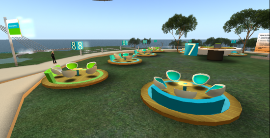
These archetypes and models eventually formed the core of IBM’s principles of virtual design.
Hamilton calls these “affordances.”
For example, a chair can be used to stand on to change a lightbulb, or to break over someone’s head in a bar fight — but typically chair is used for sitting and that is its affordance.
“So we asked a question about three and a half, four years ago — what are the afforances of a virtual world?” said Hamilton. “What can they be best used for?”
For example, one unique quality of virtual worlds is that there are no constraints on space or scale.
“If you’re teaching or learning or working with something and you need more space to figure it out, virtual worlds are perfect for that,” he said.
IBM’s work with the principles of virtual design over the past couple of years has led to a formalized methodology in which spaces are designed in accordance to this set of afforances.
“We have actually applied for a patent for this method,” said Hamilton.
Open layout
One of the most obvious ways in which the IBM facilities differ from many on the grids is in the use of transparent, curved walls — no roofs, no corners, no architectural embellishments.
“The idea is that you can always know where you are and you never get lost,” said Hamilton. “And you can see where everyone else is.”
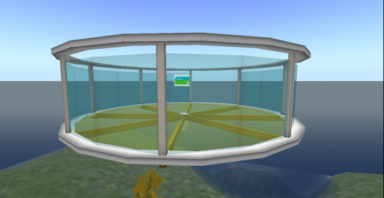
Transparent curves have two other advantages, as well. First, users who use camera controls to zoom out or to look in different directions don’t need to worry about accidentally zooming out through a wall and then having the wall block their view. Second, curved walls help keep those new to navigating virtual environments from being trapped in corners.
IBM’s facilities are also completely bereft of any internal walls.
It’s a mistake, said Hamilton, to have too many walls in a virtual environment — or to have too much stuff of any kind.
“People think it’s wonderful to work on creating individual pieces of tile for the floor, and they spend all their time on the textures,” he said.
In the IBM spaces, by comparison, all the floors are all either bare surfaces or landscape grass, and there are no cornices or valences or any other architectural flourishes.
“We try to make it very simple, very plain,” he said. “The primary purpose is the usability of the space.”
By keeping surfaces simple and uncluttered, the virtual space also loads quickly — there’s no waiting while every separate floor tile loads up.
Customizeable
But the apparent simplicity of the environment shouldn’t be taken to mean that there isn’t much functionality. In fact, the designers have packed in a large number of features that can be easily enabled by visitors. In addition, people can also bring in their own tools if they wish.
“The space can be 75 percent built and you need just 25 percent of add-ons, things that people bring to the picture, to make it work,” said Hamilton.
For example, IBM’s island in Second Life comes with a skybox — a meeting facility located high in the sky — which is an empty, translucent shell with a simple tool box. The tool box can be used to fill the skybox with a choice of seating arrangements, display screens, voting boxes, and other typical meeting room areas.
For example, IBM employees can add multiple rows of chairs, or add a conference room table with chairs arranged around it.
Another tool box can be used to instantly add break-out rooms — and tool boxes inside those break-out rooms can provide seating and display screens.
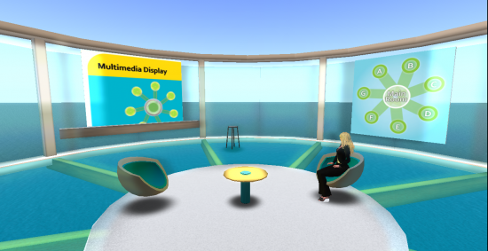
In the future, IBM hopes to have the environment controlled through a Web-based interface.
“So you can be in-world and have a surface that changes around you,” he said.
This can be used to instantly change the entire color scheme of a virtual environment, added Hamilton. For example, if one of IBM’s corporate clients was using one of their virtual spaces, it could be instantly re-branded with the firm’s corporate colors and logos.
Interactive
One tool available to IBM employees is an interactive map that allows visitors to drop pins on the locations of their home towns.
“It calculates the energy and dollar savings as a result of not having to fly to the host’s location.”
When newcomers login to a virtual environment, there’s often an orientation area, where signboards explain how to move, how to change the point of view, and how to perform other basic tasks.
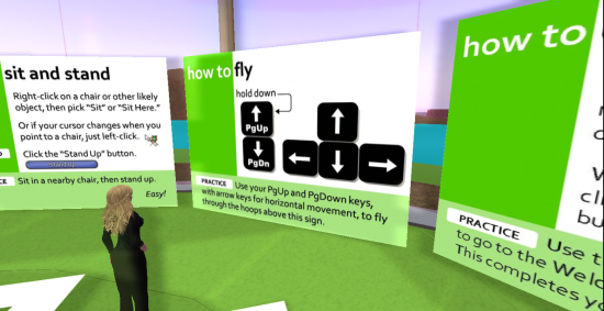
In the IBM environment, these orientation areas are all interactive, as well.

“We have the posters, but we also have an activity with each poster to make sure that they know how to do it,” said Amy Groves, an immersive learning and virtual worlds expert who works within IBM’s center for advanced learning. “There’s always interaction with every single thing.”
Consistent
One danger of having a lot of interactive tools in an environment is that it might get too confusing for users.
This often happens in virtual environments where the interactive tools come from a variety of third-party sources.
Tools are also often created by users themselves, and shared with other users.
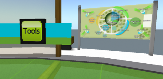
The result could be a corporate environment in which objects and tools are created by different groups at different times, and work in different and varying ways.

“Do you run into it? Do you touch it? Does it chat to you? Does it give you a menu? It’s all over the map,” said Henry Watson, virtual worlds consultant in IBM’s Global Business Services division.
It’s important to establish a consistent approach to user interactions, so that users who know how to use one tool can easily recognize and use all the other tools in the environment.
Consistency is key to “vastly improving the user experience and usability of the environment,” he added.
To avoid this, IBM’s designers work with a standard set of control panels for all the tools.
According to Hamilton, IBM has been working on a universal visual language.
“Wherever you are on the globe, there are certain visual cues that everyone recognizes,” he said. “I don’t have to tell you that a chair is a chair — you just sit on it. You don’t have to tell people what a button is — they see it, they push it.”
Using a common visual language to create control panels for in-world tools reduces the amount of help employees need to learn how to use the environment, though it can create problems for those who can’t see.
“We’re now working on making these spaces increasingly accessible to people with visual impairments,” he added.
- OSgrid back online after extended maintenance - April 16, 2025
- Analysts predict drop in headset sales this year - March 25, 2025
- OSgrid enters immediate long-term maintenance - March 5, 2025
