Two leading OpenSim hosting vendors — Kitely and Zetamex — both announced major site redesigns this week. But only one can be the winner of our first site vs. site, head-to-head redesign competition.
And, before you start yelling, I understand that these two sites have different purposes, and service different audiences. Kitely is an on-demand commercial grid that offers a community, a currency, an online marketplace, a destination guide, and other features of a social grid. Zetamex is a hosting company that hosts and runs grids for businesses, non-profits, and individuals and also provides individual region rentals on a choice of open grids.
But there’s enough that the two companies have in common to make a comparison interesting — as well as educational to other companies with similar sites.
What do they do?
The first job of any company website is to make it clear just what, exactly, it is that the company does. Kitely makes it real clear with their headline: “Get your own virtual world.”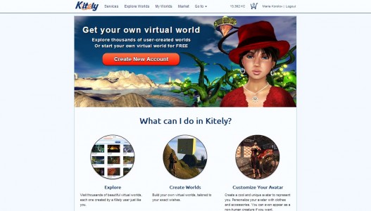
Except that you don’t get your own virtual world. You get regions in the Kitely virtual world. So this headline would actually be more appropriate for Zetamex, which does, in fact, set up entire virtual worlds for customers.
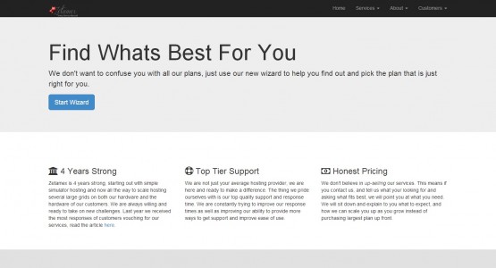
The actual Zetamex headline — “Find What’s Best for You” — doesn’t offer much of a hint. In fact, the phrase “OpenSim hosting” appears nowhere on the page — though “OpenSim Directory” does, if you scroll down, but it takes you to a non-working site.
Winner: Kitely. The headline might be misleading, but it does at least say something about what Kitely does.
Brand Identity
Does the home page help the company’s brand?
On Kitely’s site, the blue-and-orange color combination echoes the company’s own logo in the top left. The font and style of the logo, as well as the look-and-feel of the site, create a pleasant, welcoming vibe — a significant improvement over their previous design which was significantly more forma..
On the Zetamex site, the brand itself is dark gray on a black background and is thus almost completely invisible.

The font choice is more appropriate to a flower shop, and the phrase “virtual service network,” again almost completely invisible, is meaningless. The little red stars don’t fit in with the tone of the rest of the site.
If Zetamex’ goal is to position itself like an IBM-style service provider — technically savvy, dependable, experienced — it should take a look at IBM’s website. Or, a little more narrowly-focused, at Dreamhost or Bluehost.
Winner: Kitely.
Unique selling proposition
What separates Kitely from other OpenSim grids? What distinguishes Zetamex from other OpenSim hosting providers?
It used to be that I’d say that Kitely’s main feature was its low-cost, on-demand cloud region hosting.
But, today, I’d say that Kitely’s main differentiator is that it is the biggest open commercial grid. It’s the only grid that offers hypergrid connectivity and full region exports while also protecting in-world content and providing access to a giant marketplace. Anyway, that’s what I would put as a unique selling proposition if I owned a grid like Kitely. There might be a better unique value proposition that I’m missing, though.
But on the Kitely page, all the items under “What can I do in Kitely?” can describe any grid out there. Like “Explore” or “Meet Interesting People.” The last two items — “Shop for Virtual Goods” and “Earn Money” narrow it down a little bit, since there are some grids with no shopping or local economies, but still aren’t unique to Kitely.
The next section, “Why choose Kitely?” is also a let-down. The sentence “Kitely is the number one choice for hosting OpenSim virtual worlds” is not true, no matter how I look at it. Kitely isn’t a virtual world hosting provider — that would be Zetamex or Dreamland. Kitely hosts only one virtual world — Kitely. It is not the biggest grid out there — that would be OSgrid, or, if they’re still running giant varregions, Virtual Worlds Grid. Kitely is the biggest commercial grid by land area, and could say that, instead.
“Vibrant community,” “Easy to Share,” “Low Prices” could apply to many grids. So can all the other items listed, especially when taken individually. I see no evidence of a unique selling proposition on this page.
Back to Zetamex. For me, their unique selling proposition is that they’re the only major OpenSim hosting company based in the United States. Again, there might be a better one that I’m missing. But location is a key factor for many customers, who want a company that speaks their language and works in their time zones.
The Zetamex home pages offers a few reasons to pick their company — that it’s been around for four years, that it offers good support and honest pricing, and has a management panel. Â None of these are unique and, in fact, are not really differentiators — do other hosting companies really lie about their pricing?
Similarly, the ZetaPanel is not unique. Well, its name is unique, but the ability to save and load OARs and IARS via an online interface is available from other vendors as well. And though Zetamex claims that its panel has a “clean interface” the image included is full of abbreviations like “ATvPrm” and “PndUP” and “NoAckKB.” This information might be extremely useful for some advanced users, but it does not make the interface look appealing or clean to people new to OpenSim.
Winner: Reluctantly, Kitely. Their home page does mention hypergrid access and exports and marketplace as separate features that, together, do add up to a unique value.
Clear call to action
Now, I’m not a mind reader, so I can’t be completely sure what Kitely and Zetamex want their customers to do most.
My guess, however, is that Kitely’s top priority is to get their site visitors to sign up for new accounts. And that Zetamex wants people to buy hosting services.
Kitely is the clear winner here. Their “call to action” button is right there in the middle of the screen.
My only suggestion would be to pick a slightly different color — maybe one a bit more orange or yellow for the “Create New Account” button since the red outfit of the woman in the picture pulls some of the attention away. So does that weird cone thing that either seems attached to the avatar’s hat, or is a floating island in the sky.
The Zetamex home page doesn’t even look like a home page — with only text on it, it looks like an inside page. And the phrase “We don’t want to confuse you with all our plans” makes it sound like their plans are confusing.
My recommendation? Customers are coming either to rent regions, or to find out about setting up a grid. Those who want to rent a region probably already know that they want to rent a region, and would probably prefer to jump straight in and see the prices. Those who want to rent a grid will probably want to talk to someone at the company first. I’m guessing here, of course — only the vendor would know for sure whether grid customers need to talk to someone before buying or not. But if they do want to talk, I’d put up a second call-to-action for scheduling a call, or getting a personal tool of a demo grid system.
Clicks to action
So I decide to go ahead and create an account on Kitely, or rent a region from Zetamex. How many clicks does it take before I’m there?
On Kitely, using Facebook or Twitter to set up the account: three clicks to get to the sign-up page, then an email address, a password, a checkbox, choice of gender, and the one last “Create” click.
On Zetamex: Click on “Services” in the menu, click on “Simulators” — though I’m not sure whether this actually gets me to the region rentals or not, and there’s also the “Cloud Simulators” option and I’m not sure which one I want. Third click on the $15 per month option, then click on “Order” under “Classic Simulators” — though, again, not sure if maybe I shouldn’t be clicking on the cloud ones, instead. Then type in my company name, my name, email, and choose the grid from the drop-down list and “Next.” Then another opportunity to choose the price level, though this time with no explanation of what the different options mean — I should have paid more attention two screens back. Then number of regions. Now, I understand that I’m buying a simulator which can support between one and four regions — I remember this much from that first screen — but people who think that a simulator and a region are the same thing are going to be very confused here. Now I enter the region name, estate name, coordinates, and the URL of the OAR file. I left most of these blank because other than the name of my region, I don’t know the answers to those questions. I click next, then agree to the terms of service, and click “Submit.” And then it thanked me for my order. An invoice was sent to me by mail.
The winner is Kitely again. Their process is very simple, quick and streamlined and asks only for the minimum information necessary. Most important, it never asks me questions I don’t know the answers to.
With Zetamex, there were a number of places where I didn’t know what the answer was — should I get “standard” or “cloud”? What are my region coordinates? What is the URL of my OAR file?
I do know how much money I have to spend, and I can make an intelligent guess about how many visitors my region will get, and how many prims I want.
By the way, if you want to see an example of an extremely easy, streamlined region ordering process, check out Oliveira. I’m not saying their site is perfect, but it takes just two clicks to get to the order page, and it never asks you any questions you don’t know the answer to.
Price List
As a customer, one of my biggest concerns is cost. If I can’t afford it, it doesn’t matter how great the product is.
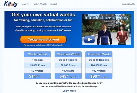
On Kitely, the prices are listed under Services and the “Metered Worlds” option is beyond confusing. The term “World” to mean “island” is also confusing — Kitely worlds are not stand-alone grids, which is what the word “World” normally means. They’re simply islands of one, four, nine or 16 regions. But that’s a long-running peeve of mine.
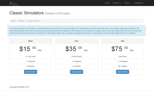
On Zetamex, the prices are on four separate pages — Classic Simulators, Cloud Simulators, Grid Services, and BYOS Services.
I’m going to give this one to Zetamex because even though you have to flip back and forth between pages to figure out how much things cost, on the Kitely page trying to figure out what the metered regions cost is all but impossible.
Contact Info
If I have questions, I want to know how to contact the company. Plus, it’s always nice to know that there are real people in the business. I like seeing real names and addresses, and photos of executives, and their email addresses. I also like having email forms, for when I don’t care if a question is answered by a random customer service agent. I don’t necessarily want to bother the company founders with every little question.
On Kitely, the contact page link is at the bottom of the screen, which is normally the second place I checki. It lists a real mailing address, and provides links to fill-in forms for abuse reports and DMCA takedown notices, as well as a generic email address for other questions. There is also a second About Kitely page with the names and photos of the founders, and the company’s Facebook and Twitter links.
On Zetamex, the contact page link is called About Us and is linked to under the About menu at the top of the screen — the first place I look.
It offers a real name and address, as well as a phone number to call.
I’m going to call this a draw. Kitely offers the forms and the email address, but Zetamex has the phone numbers.
Social Proof
When I’m deciding whether to buy something on Amazon, I always check the reviews. Did other people buy it? Did they like it? What’s the worst thing about this product — is it something I can live with?
The pictures of avatars on the Kitely home page are kind of an implied form of social proof. Clicking on the Forums button takes me to a much better kind of social proof — discussions between actual current users. The Kitely forums are extremely busy with lots of different comments by lots of different people. Unfortunately, the “Vibrant Community” section on the home page doesn’t actually take you to the forums, even though it invites visitors to check them out. Similarly, the “Earn Money” section doesn’t actually link to the Kitely Market, though it mentions it.
Bottom line: there’s a lot of social proof there on the Kitely site, but it’s not really front-and-center in the new redesign. Instead, there’s a lot of space allocated to features which probably are not a high priority for people making the decision about whether to sign up for a user account or not.
On their home page, Zetamex refers to a Hypergrid Business hosting providers survey where their service got the most votes of any hosting provider. Not the highest scores — just the most votes. Which is surprising, given that Zetamex has a number of customers who have gone public with the fact that they’re happy with the service they’ve been getting.
Winner: Kitely. But just barely. Both companies can do a lot better when it comes to social proof
Final verdict
Kitely’s redesign comes out on top in helping build the company’s brand identity and in having a clear call to action.
The site could use more social proof on its home page, and a clearer statement of its unique value proposition.
Zetamex, however, needs a complete overhaul of its site, starting with its logo design and color palette all the way through to its ordering process.
- OSgrid back online after extended maintenance - April 16, 2025
- Analysts predict drop in headset sales this year - March 25, 2025
- OSgrid enters immediate long-term maintenance - March 5, 2025

