As a technology journalist, I get to look at a lot of vendor websites. As a former newspaper and magazine editor, I’ve done my share of layout and design.
So as I look at OpenSim hosting websites I can’t help think of all the ways they can be improved in order to increase purchases.
Here are some reasons why website design is important:
- If a website doesn’t look like what the customer expects a technology vendor website to look like, they’ll get a bad gut feeling about the vendor, and decide not to buy. They might not be able to put it into words, but they’ll have a sense that something is off.
- If a website is filled with technical jargon or specifications, the customer might decide that they don’t know enough to buy hosting. I’ve run my own grids on my home computer, and I feel stupid when looking at some websites. Okay, I have teenage kids, so I feel stupid a lot and am used to it. Other people might decide that they’re too dumb to get their own grid, and they’ll be too embarrassed to ask to explanations, so they’ll just go away.
- If a website asks the visitor to make a choice that they can’t make, they’ll just leave. For example, do you want a “dedicated package” or “standalone hosting” or “simulator hosting”? Aren’t they all the same thing? How much memory do you want? How many processor cores? Do you want Ubuntu, Debian, or CentOS? Sure, there are people out there who know all this stuff. They know exactly which version of OpenSim they want, exactly what processors, what operating system, whether they need Robust or Simian — they’re the perfect customer. And they don’t need you! They know enough to rent a bare server and run their own grid. The reason they want to give you money is so that they can avoid having to learn all this stuff. They’re busy enough trying to keep up with everything else in their lives.
So here are some rules of thumb for creating a vendor website that sells.
Control your colors, fonts and layout elements
As a general rule of thumb, the more conservative the color scheme the bigger the company. If you want to project a feeling of safety and security to your customers, mimic the sedate color scheme of a large corporation. Of course, these days, the large corporations are trying to mimic the look and feel of small startups, with bright colors and punchy headlines.
Remember that the easiest text to read online is black letters on a white background. You can use light text on a colorful background for headlines, banners, buttons, and other featured elements on your website, but remember to make the text a couple of sizes larger than you normal to compensate.
Similarly, pick just one type face for most of the text on your site. You can use a second typeface for special elements like buttons or headlines. Avoid underlines or italics if you can — they’re hard to read.
Finally, have a limited number of clearly defined areas on your website, with an obvious focal point. All information not pertinent to the most common buying decisions should go on inside pages.

The fewer choices, the better
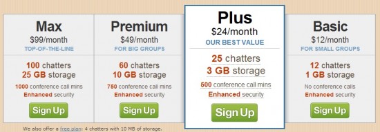
As a general rule, offer your visitors between three and five choices for the main shopping decision. Highlight one of the middle choices as the most popular one.
Even without the highlighting, most people tend to naturally gravitate towards the middle option, while a few will always go for the cheapest or most basic choice, and a few will always go for the priciest or most high-end option.
If you give folks what they need at a reasonable price and in a convenient way, many will buy it from you, even if competitors offer a better deal, simply because you’re giving them simple and clear choices.
If you’re offering different types of grid hosting services, here’s one way to organize them:
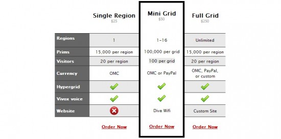
- Single region: Choice of OSgrid, Metropolis, FrancoGrid and Craft. Up to 15,000 prims, 20 visitors.
- Mini grid: One to 16 regions. Up to 100,000 prims, 100 visitors.
- Full grid: Full turn-key solution for community grid with profiles, search, custom currency, and unlimited regions.

I frequently see hosting companies using the term “standalone” to refer to regions that are not connected to larger grids, or to Diva Distro-style minigrids.
The term “standalone” is technically correct, but it means something different in regular English than it does to OpenSim developers. A developer instantly knows that a “standalone” is a kind of configuration of OpenSim. But to a normal person, “standalone” just means that something is by itself. And that could mean almost anything.
Similarly, the term “grid mode” means something specific to OpenSim experts. But regular people aren’t going to understand why they should care about the mode. They do care, though, how many regions they can have.
The important thing is to translate what’s going on in the back end — what specific technology you’re using — into what the customer is going to get. You might be offering a certain combination of processor cores and RAM — but the customer is getting a Second Life-equivalent region.
I personally recommend using the number of prims and the number of maximum visitors as indicators of a region’s capacity, since those are terms that most region buyers will understand, especially if they have previously used Second Life.
So if you’re offering region hosting, with different pricing levels, you can organize it something like this:
- Landscape region: up to 1,000 prims, 20 visitors (or whatever your particular options are)
- Starter region: up to 5,000 prims, 20 visitors
- Basic region: up to 15,000 prims, 40 visitors, similar to Second Life
- Business region: up to 40,000 prims, 60 visitors
- Premium region: up to 100,000 prims, 100 visitors

It can also help to provide a little additional context with each option.
So, for the “Landscape” region, you could say, “Perfect for role playing landscape or sailing areas.”
For the “Business” region, you could say, “Perfect for a shopping mall or busy event venue.”
Must-have site elements
There are certain things that every vendor needs to have on their home page.
For example, if your customers have accounts that they need to access from your website, there should be a “Customer login” button or drop down form of some sort on your site. It needs to be in a prominent enough location that your customers can find it, without getting in the way of first-time visitors. Most sites put it in the top right corner.
There should be an “About us” link to a page that explains where your company is located and who runs it. People are going to be giving you real money. Making it clear that you’re a real company, with a real address and real staff, dramatically increases the trust level that people will have.
Photos and brief bios of management staff, a photo of your company headquarters building — or of your virtual headquarters, if you’re a virtual company — a mailing address, the name under which your company is registered or incorporated, all help.
There should be a “Contact us” link to a page that has a contact form. I would also highly recommend an email address for people to use who don’t like filling in contact forms.
Since this is new, scary technology, try to make it this page as human as possible. For example, you could put a picture of your top sales guy — or of the company head, if it’s a small shop — with their email address, and a note that says something like “Contact me! I will answer your questions. I will get you what you need. I’m here for you!”
Marketing elements
The following are not must-haves, but they can all help persuade a customer to part with their money.
Likability: A cute mascot can make your company feel friendly and approachable. That could be a cartoon, like the cow of FatCow hosting. Or a middle-aged white guy, like the old Wendy’s guy. Or it could be an avatar. If you take this route, keep the imaging consistent throughout your site and in all your other promotional materials and in-world locations.
Authority: People want to give money to a competent company. Are you regularly quoted in the media as an expert? Do you have advice columns or white papers? Are you an OpenSim core developer? Do you have a history of valuable contributions to the community? Play them up in your design.
Do the customer a favor: Give the customer a freebie. A free trial. A free e-book. A free starter region OAR or terrain. If you have an in-world office that people can visit, you can give out branded merchandise — virtual T-shirts, caps, productivity tools. But you can also give these items out as free XML or IAR downloads. Freebies make the customer feel that they owe you, and they’re more likely to buy.
Flattery: The metaverse is the future. The customer who has a virtual presence is thinking ahead, learning valuable skills, setting themselves apart from ordinary people. If you can come up with a way to illustrate this, it will help sell the product. The illustration doesn’t have to be literal — T-Mobile is using fast cars and hot women to sell their mobile phone service by saying, in effect, “If you’re our customer, it’s like you are hot and drive a fast car.” Use aspirational imagery — a futuristic city on a hill, space exploration, a complex chip diagram can be symbols of the future. Or taglines like “Stepping into the future,” “A virtual leap forward,” “Training for the new millenium.”
Association: For many people, their first choice of vendor is the vendor recommended by someone they trust. Ideally, you would get a customer to give you a recommendation, and you would put that recommendation on your home page. The recommendation doesn’t have to come from a customer, though — a celebrity endorsement would work, or a recommendation by the media. I have a list of recommended vendors on my OpenSim vendors page — it’s fine to use that to promote your company. You can also use partnerships to promote your company, like if you have starter regions by a well-known designer.
Give a reason: Almost any reason will do. In an experiment, 60 percent of people said yes to “Excuse me, I have five pages. May I use the Xerox machine?” But when the question changed to “Excuse me, I have five pages. May I use the Xerox machine because I have to make some copies?” the percent who said yes went up to 93 percent. (See the book Influence: The Psychology of Persuasion by Robert B. Cialdini for more about this.) In marketing terms, you could say, “Act now because time is running out” or “Order from us because we’re the best in the business.” And if you test this technique, making the same offer with and without the “because,” let me know how it turns out!
Get them started with something small: The idea here is that you get people used to saying yes to you. For example, you can rent them space for short-term events. Or you could ask them to sign up for a gridmaster tips newsletter. Or follow you on Twitter or Facebook. Or join your Google Plus group. Or you can put up a button that says, “Email me when you have your next sale.” You’re developing a relationship with your customer, which increases their chances of buying from you, or recommending you to others.
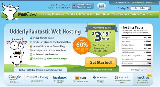
Time is running out: I love what FatCow has on their website — a countdown clock to when their sale is going to be over. Change up the offers regularly. Customers will often return several times before making a purchase decision, especially if it’s a large one. You never know which offer is going to be the one that grabs their attention and spurs them to act.

The FatCow website has several other marketing elements that illustrate some of the ideas in this article. For example, instead of giving numbers for disk space or bandwidth, they just say “Oodles.” In fact, there are very few numbers on this page — the sale price, how much they’re going to save, how much time there is left on the sale.
Meanwhile, the Google, Yahoo, WordPress and Joomla are very recognizable logos. They make the customer feel instantly more comfortable with the company. They might not know FatCow, but they know the other brands. These aren’t endorsements, but they almost feel as if they are.
Note also the customer login links at the top right, the phone numbers, and the way technical information is either below the fold or on inside pages. Advanced customers can find this information easily, but it won’t scare away people who aren’t as tech-savvy.
- OSgrid back online after extended maintenance - April 16, 2025
- Analysts predict drop in headset sales this year - March 25, 2025
- OSgrid enters immediate long-term maintenance - March 5, 2025
