The following mistakes are totally and completely a matter of my opinion. I don’t expect grid owners to rush out and redesign their websites because I didn’t like some aspect of it. However, if you’re designing your website for the first time, or planning a make-over of your existing site ask yourself if your plans involve any of the following.
1. No reason to visit
There are hundreds of grids running the OpenSim software. Why should people visit yours? It takes time to configure the viewer, create an account, and dress the new avatar.
This is a problem with every grid website out there. And it’s also the single hardest question for a grid owner to answer. Why should someone visit your grid? Typical answers are to build stuff, to meet people, to roleplay, to shop, to learn. But this is true for pretty much every virtual world out there. And, in fact, if someone is looking to do these things in a virtual world, the best place, frankly, is Second Life.
OpenSim does have three things that Second Life doesn’t have: low cost, hypergrid, and private deployments. The last one doesn’t apply to the big social grids. The first one applies to all OpenSim grids. And hypergrid connectivity might be a differentiator, but it’s not a unique property of one particular grid.
But there are unique properties that grids can promote, but don’t. OSgrid is the largest grid, but you can’t tell that from its website. But that’s probably the main reason that folks pick OSgrid. InWorldz is the most active grid but, again, this fact isn’t spotlighted on the home page, even though, again, it’s probably the main draw.
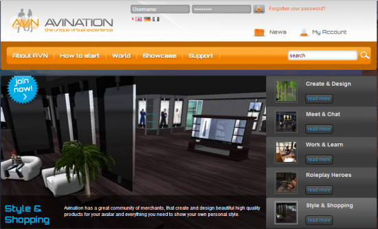
Even Avination, which, in my opinion, currently has the best-looking website of any OpenSim grid, makes this mistake.
There is very little on Avination’s home page that is specific to the grid. If you replace the grid name and branding, you could use this website for pretty much any grid. The only exception is a banner across the bottom right of the screen, which is only visible on large monitors, which says that Avination uses the CCS Combat System. Is that the best combat system available? Is Avination the only OpenSim grid to have it? The answers are yes and yes, but you have to scroll down to the bottom of the page to find out.
My advice:
- Instead of saying that a grid has shopping and brand-name merchants, showcase those brands on the front page and promote them. Be as specific and positive as possible. For example, instead of “come to our grid to buy hats from the best designers,” say: “Hats-R-Us, the best hats in the metaverse, has an all-new spring collection!”
- Spotlight upcoming events. If a store is having a grand opening, or there’s a building contest, or a party, or an exhibit, or a music performance, these are all unique attractions that make it urgent for visitors to create avatars and get in-world or hypergrid teleport over — otherwise, they’ll miss out. People hate missing out.
- Spotlight unique activities. Ongoing role play events, building classes, speed dating events help show a grid’s character, and make the grid seem busy and vibrant.
- Spotlight unique destinations. Do you have the biggest or best shopping mall on the hypergrid? The biggest or best museums? The biggest roleplaying continent? The fastest race track? The biggest sailing sea? The original Folk Cafe? Â If the destination is in line with your grid’s identity, spotlight it on the home page.
- Spotlight big-name customers. Does Harvard have a virtual outpost on your grid? Does McDonalds own a region? Does Beyonce hang out in your grid’s cafes?
Keep in mind that events and attractions can change quickly, so a grid website needs a content management system that allows for easy updates. Don’t hire a designer to create a hard-coded front page where you have to bring them back and pay for any change. I typically recommend magazine-style WordPress themes for new sites – they look great, cost little or nothing, and are easy to customize and update. Look for “responsive” themes that automatically resize themselves to fit any screen size or mobile device.
2. Too much focus
I wouldn’t normally think that it was possible to be too focused.
But the Kitely website, with its single-minded effort to rent you regions, does just that.
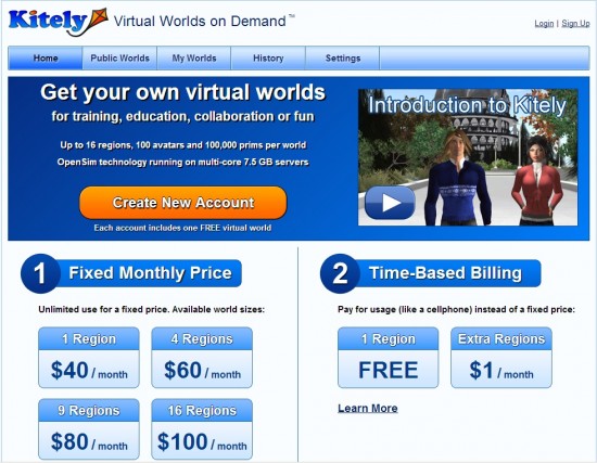
From the first glance, it’s clear what Kitely’s unique selling proposition is — regions for as little as $1 a month. And Kitely does a great job of putting this unique selling proposition front and center. But there are other reasons to use Kitely besides price.
For example:
- Kitely is very easy to use. This could be illustrated with an image that shows quotes from satisfied customers, or review writers, about how quick it was to set up their first region.
- Kitely was mentioned in a Wired story. For some people, that’s enough to give it a try.
- Kitely is used by some brand name customers, such as educational institutions, design and consulting firms, and artists. But you have to hunt around to find this. Such as the free English lessons, the virtual health training center, a virtual incubator for non-profits, a school for DJs, an HIV/AIDS resource information center, an Aspergers and autism resource center, and too many art exhibits, museums, and historic recreations to list here. I didn’t know about most of these until just now.
3. No call to action
So I’m on your page. What do you want me to do? Nothing? Okay, I’ll go away, then.
A visitor is much likely to do something if you tell them to do it and then make it easy for them to do just that. Do you want them to register? To come to an event? To sign up for a newsletter? To buy land?
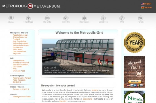
Most grids do fairly well in this area, with prominent calls to action on the home page, such as “Create your avatar!” or “Join now!”
Metropolis is one of the few has no clear call to action, though there is a donation button on the right.
But where most grids fail is in getting people to buy something. Commercial social grids make their money by renting land. But you wouldn’t know this from looking at, say, the InWorldz home page, which hides its “Purchase land” link under the “World Map” menu item — and people have to log in to see the page.
Now, it may seem obvious that people should have an avatar on a grid if they want to own land there. But doesn’t it make sense to take their money first, then, if they don’t have an avatar yet, create one for them? The more steps there are between the moment that someone decides to buy, and the moment they hit that final “Submit payment” button, the more opportunities there are for the person to change their mind, to decide to do it later, to get distracted by something, or just to get tired of filling stuff out.
4. Too much stuff on the page
I am totally in favor of having lots and lots of stats available. In fact, I wish grids published more statistics, like economy statistics. But not all these numbers have to be on the home page.
Lost Paradise, for example, seems to be going overboard with the data. The stats box shows active logins for the last 30 days, the last seven days, and the previous 24 hours. Â The primo central spot is used to proclaim that the grid is “Running On A Linux Kernel 3.8.4-102.fc17.x86_64.” Is that really the most important thing about the grid?
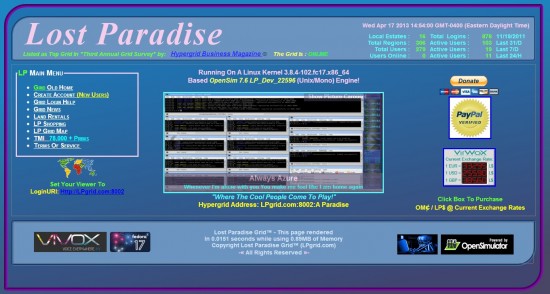
The top right corner features the current time. I don’t know about you, but I have the current time displayed in the my Start bar.
The footer explains that “This page rendered in 0.0151 seconds while using 0.89MB of Memory.” There are currency exchange rates on the home page, the grid’s login URI and hypergrid address — stuff that gets in the way of showing what the grid is about.
The grid’s slogan is “Where the cool people come to play!” but the design says, “Home of actuaries and accountants.” The photos shown in the carousel seem tiny and washed-out when surrounded by all the data, and it doesn’t help that some of the featured images are of server statistics and of the servers themselves.
My advice:
- Make the images larger, and focus on pictures of people having fun. Specifically, having fun that they can only have on Lost Paradise.
- Move the numbers and the server specs to an “About us” page.
- And, most important, get rid of the all-but-impossible-to-read blue-on-blue font choices.
5. No graphics
MyOpenGrid has a picture of three avatars on its home page, but they’re located below the fold. Unless you scroll down, you wouldn’t know its there — and as a result, the home page looks more like an interior page than a home page.
Well-chosen graphics on a grid’s home page serve a number of purposes.
First, they make it clear that the website belongs to a virtual world.
Second, they illustrate the kinds of activities that happen in this particular world. Romantic encounters, role playing games, shopping, parties. A well-chosen image or set of images can show the visitor that there’s stuff on the grid they want to check out.
Third, a good graphic can instantly demonstrate a grid’s uniqueness. For example, a gallery of unicorn images will immediate indicate that your grid is a haven for unicorn lovers.
Finally, people like looking at pretty pictures, at celebrity pictures, and sexy pictures. They’ll feel happier, and associate that happiness with your grid.
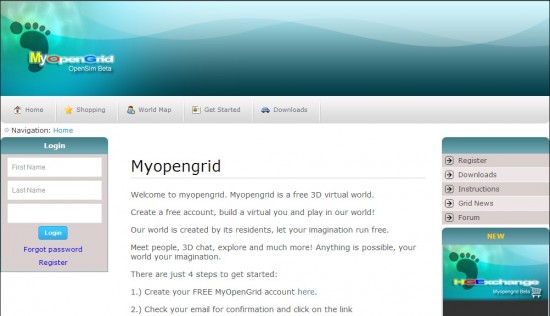
My advice:
- Move the login instructions to an interior page or down below the fold.
- Make the login box smaller. InWorldz has a great drop-down login box on the home page.
- Make the header smaller, or move the right-side menu up into the header. Or both.
- Use the central space for an image or video slideshow. There are many free or low-cost slideshow plugins available, such as these responsive WordPress plugins. Responsive means that they resize automatically for different screen sizes and mobile devices.
6. Too many graphics
A webpage should have an obvious focal point, where the most interesting and most important stuff is happening.
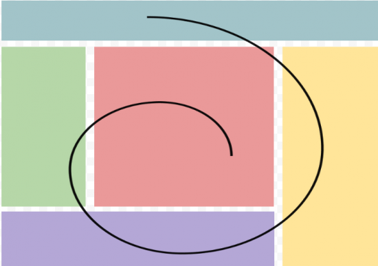
The block layout illustrated above makes it easy for the viewer to process the content on the page. Dividing sections into unequal halves or thirds is pleasing to the eye. You might recognize this as the golden ratio common to snails, art, architecture and, now, websites.
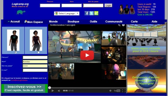
The Logicamp grid home page, by comparison, is packed full of images. You don’t know where to look first. The images also have a hard time standing out against the dark blue background. It doesn’t help that the central image — a video — is itself composed of several images.
7. Hard to read
Several grids make the mistake of putting light text on a dark background, instead of the other way around. It does look cool, but it is very very difficult to read.
UFSGrid is the prime offender here, with gray text on a black background, but it’s a science fiction-themed grid, so I kind of see where they’re going with it. Plus, they’re probably targeting the young male demographic, with good eyesight and a preference for black.
But Virtual Highway is a general-purpose social grid, targeting all age levels, including old fogies like me who have to squint to read small type.
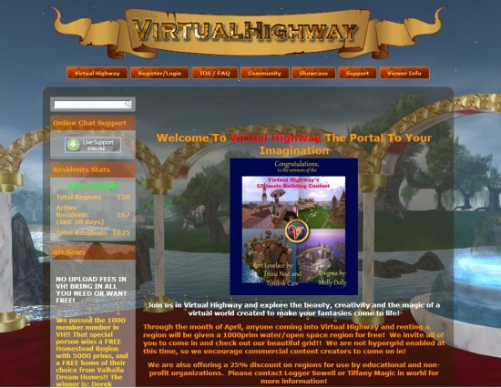
This home page features a lot of different colors — blue, brown, gold, green, orange, yellow, red, and green. The background is different colors, the text is different colors, and the accent elements are different colors. Even the banner at the top is hard to read, since there isn’t enough contrast between the letters and the background color.
The home page is also text-heavy, though you have to scroll down to see most of the text. How many people are going to read all that to find out about the special promotions, or the fact that there’s a surfing association on the grid? I did not know about the surfing association until now, and I’ve been checking this site at least once a month since the grid launched.
Most of the text can be condensed into brief headlines, with links to longer stories for people who want to find out more. That would free up space for more images showcasing the grid’s unique qualities and a call to action such as “Get your free avatar now!” or “Rent one region now and get second water region free!”
- OSgrid back online after extended maintenance - April 16, 2025
- Analysts predict drop in headset sales this year - March 25, 2025
- OSgrid enters immediate long-term maintenance - March 5, 2025
