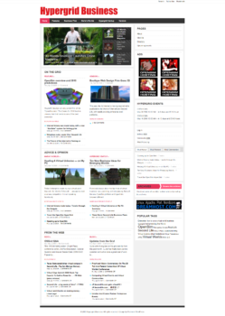
Hypergrid Business has had exactly two site designs during its ten-year history. From 2009 to 2014, we were using a WordPress theme called The Stars, and were using it even after the company stopped supporting it.
Here’s what it looked like when it first launched:

Then, in 2014, we switched to Hueman, the theme we’ve used since then. However, the theme has been looking dated. Originally, I did a lot of custom work on it but started having issues with the site because all the custom work prevented me from updating the theme. I wound up having to throw out all the custom work, and, for the past few months, the site hasn’t looked as good as it did in the past. Plus, as I mentioned, the theme is pretty dated.
So I’ve decided to switch to the Hoot Du theme. It’s available in both free and paid versions, with the paid version costing $55. I’ve been using it on several other sites for a while now, including my personal site, MariaKorolov.com, and find that the free functionality does everything I need. It’s very easy to use but has a ton of options, so you can make it look like almost anything.
For example, our new writer Alex Korolov, whose byline you might have seen popping up the last few days, uses it for his home page, AlexKorolov.com. It looks very different the way he has it set up, but it’s still the same theme.
If you’re a grid owner and want to use this theme for your grid, there’s an option so that you have one big image — or a slide show of big images — at the top of the page. That’s a good way to showcase life on your grid.
While we’re switching to the new design, there might be some hiccups. Please forgive the mess!
- Analysts predict drop in headset sales this year - March 25, 2025
- OSgrid enters immediate long-term maintenance - March 5, 2025
- OSgrid wiping its database on March 21: You have five weeks to save your stuff - February 15, 2025

