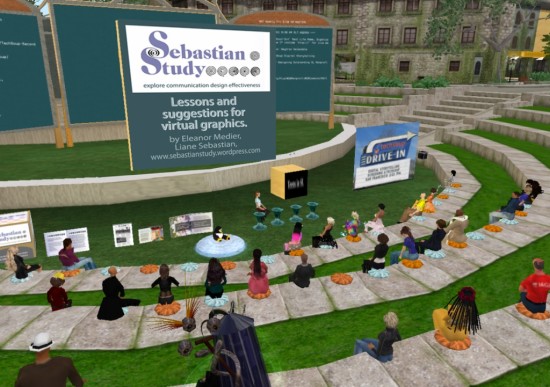
It was an honor to present to the Nonprofit Commons in Second Life. A wide range of organizations were represented by their avatars in the central arena. There to discuss signage, I discussed tips and ideas for how they can improve their signage overall. Although most of the organizations, unfortunately, design their own signs, there are still ways that they can improve by following some basic considerations. Hopefully they will grow enough where they can afford to give their group a graphic face.

Sitting off to the extreme left, my avatar waits to make the next presentation. My title slide is up, a cube of my sign designs, and four examples of inworld books.
So here is a synopsis of the presentation that I made to them:
Lessons and suggestions for virtual graphics
Perhaps the biggest frustration for visiting any location in Second Life is to figure out where you are. How many times do you tp into a spot and it takes five minutes just to figure out if you are in the right place? I assume that I am not alone in this.
In real life, my graphic design and publication practice primarily services nonprofit organizations. So naturally I have been studying the design of Nonprofit Commons. And because I write about design as a published author of print books and articles, I have been blogging about my discoveries and what I have learned here. I am thrilled to be asked to share my perceptions and hope that my comments are useful to you.
The most important thing any organizational director can do in their Second Life presentation is to take a step back and try to put him or herself in the shoes of the visitor. How easy is it to see the signage?
The most important concern, as your first face to every visitor, considerations that will help improve your presentation:
1. Â Placement. It is better to have more smaller signs than a single large one. Many organizations place a sign above the door, causing the newly arrived avatar to have to look up. The first place to have a sign is where someone can see it at the landing point. Then, there needs to be one by the door. Finally, there needs to be one just inside. In Nonprofit Commons, it makes sense to also have one on the roof.
2. Clarity. Many signs are very hard to read. A good test is for how small it can be made and still be legible. Boldness in Second Life is very important because people move fast and look at images from a great range of distances and angles. Any image that doesn’t hold up misses an opportunity to grab.
3. Distinction. A simple, bold, and visually expressive logo combined with a unique color pallette works the best in helping to attract visual recognition. Consistency between visual components for an organization is achieved through a defined identity.
4. Welcoming. Beyond the placement, the more creative the greeting, the more quickly the visitor will become engaged. Visual techniques, modular content, special concerns, publications, events—these are all opportunities to entice.
5. Informative. Presenting a sign of more than a very short paragraph is presenting a sign that won’t be read. Four sentences maximum. It is better to have more signs with less on them than fewer signs with more on them. Also, psychologically, people always seem to read captions. So caption photos wherever possible. Make the content as visual as you can with a photograph, diagram, or chart.
Visiting all of the organizations in Nonprofit Commons, evaluating what they do visually and in marketing, I also learn more about how they operate, meet expectations, and fulfill their missions. My fascination with business is equal to my fascination for virtual reality as a publishing medium. Like blogs, websites, wikis, etc., Second Life has a role to play in the suite of communication tools. But what makes it much more special are the collaborations, personal friendships, and international stage.
(A version of this article appeared previously at Sebastian Study and is printed here with permission.)
- No Excuses for Poor Signage - February 4, 2011
- Virtual designs lack graphical appeal - November 2, 2010
