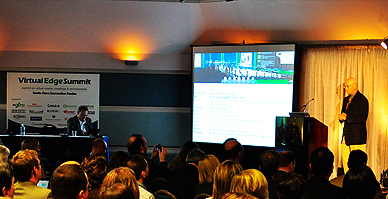
Every year I look forward to attending the Virtual Edge Summit online. Not only is it free to consume the content online and saves my travel budget (one of the keys for virtual events) but it also showcases some of the top vendors and trends in the virtual event industry. One thing that amazes me about many of the event platforms is how they use an in-person conference metaphor to navigate through the events. Many will have a picture of a high ceiling conference hall, information booth, a movie theater for watching sessions, partner exhibit hall with booths that mimic an in-person booth and lots of images with people walking around. Does this in-person metaphor provide value to the digital event user experience?

When I go to Netflix, they don’t send me to a site that looks like a video store and the player doesn’t look like a movie theater with people sitting in rows of chairs. Pandora doesn’t look like a radio. So why do we insist on building virtual platforms that keep the look and feel of big conference halls? The exhibition hall was set up the way it was to accommodate 1000s of attendees walking through a physical space. Trade show booths were set up for in-person attention getting and salesperson/attendee engagement. I don’t know if leveraging the same visuals in a digital environment is the most effective user experience in a digital model. As traditional marketers it’s sometime difficult to let go of engrained models we’re familiar with.
Some things to consider when evaluating the user experiences for virtual events:
- Who is your audience? Will they be receptive to navigating a maze of pages to find the content they want or would they prefer a more direct access to the content?
- Are your metaphors and labels clear to your audience? Common verbiage for an in-person event may not make sense in a digital environment. A picture of a fish bowl at the partner booth may be clear to an in-person event manager but will your audience understand what it’s for in context of a web page? Can I easily figure out where to click based on what I want to do or do I have to guess and click several times?
- Immersive environments may seem like a cool and exciting concept to marketers and first time attendees but does the experience hold up over repeat engagements? Once the attendee has mastered the learning curve it will be easier for them to navigate your environment but is the site and content robust enough to push them through the challenges?
- Is there an simpler way to represent what you want to do in the digital environment? Can a simple button/s on a web page do the same task as an elaborate graphical interface?
It’s important to test performance with our audience – some immersive environments may appeal to certain personalities which may increase participation while other personalities may want something more direct. It’s good to see some of the virtual event platform vendors providing more varieties of user experiences. I’m not sure we’re there yet but it’s a good start.
I’d be interested to hear from virtual event marketers who have done A/B testing or have done extensive comparison between various user experiences.
(This column reprinted with permission from Digital Marketing Muse.)
- Bringing Virtual Events into the Mainstream - January 31, 2011
- Why Must Virtual Events Look Like In-Person Events? - January 18, 2011
