When it comes to graphics, I’m not much of a power user. I mostly stick with cropping and scaling in Paint.
People who know what they’re doing using Photoshop or its free, open source alternative — GIMP.
When I absolutely positively need to use GIMP for something, I Google how to do it, follow the instructions, and forget them immediately afterwards. Because GIMP made no sense to me.
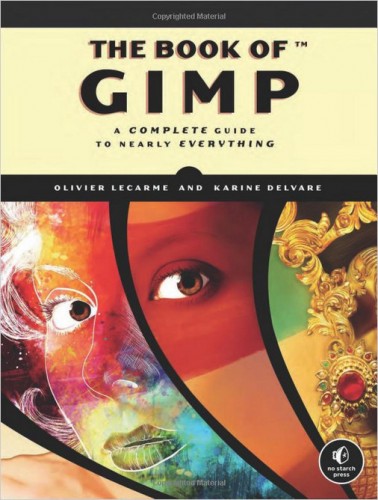
But I was recently sent a book to review — The Book of Gimp — and learned a few handy techniques as a result.
More importantly, I learned a bit about how GIMP is organized, which makes it easier for me to use the program without having to refer to instructions each time.
The book is divided into two main parts. The first third is an introduction to GIMP, which was straightforward, accessible, and easy to read. The second part, the other two-thirds of the book, is a reference manual that I just skimmed through. However, this reference manual is the reason why I plan to keep the book handy, on a bookshelf right next to my desk.
1. Getting lost in the GIMP windows
Whenever I open GIMP, a whole bunch of windows pop up — every tool box gets its own windows, every dialog, every image.
I learned that the latest version of GIMP — 2.8 and up — has an option to combine everything into one neat window.
I did not know that I needed this function. I did not know that my version of GIMP was out of date. It wouldn’t have occurred to me to Google either of these things, since I didn’t know that I didn’t know them.
I’ve since gone and installed GIMP 2.8 and am happily enjoying my all-in-one-window view, instead of losing dialogs and windows all over the place. I have two monitors, and also keep a lot of different applications running at once, so it’s easy to lose things.
How to switch to a single window in GIMP 2.8: Go to Windows -> Single- Window Mode
2. The joy of layers
One of the reasons that I’ve avoided using GIMP in the past is because of all the layers. I never knew what I was selecting. My crops never cropped the right thing. The erase tool never erased.
The Book of GIMP has a great explanation of how layers work.
They’re basically like transparency sheets. You can stack them any way you like and rotate them and scale them and color them independently of one another.
I played around with the layers a little bit as a result of reading this book. Then, when I was making some framed photos yesterday, I put my new knowledge to use.
In the past, I would have opened up two images in Paint — a picture of a frame, and the photo to be framed, then stretched and rotated each separately, then pasted one on top of the other until they fit right.
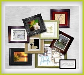
This time, I used GIMP. I opened an image with a nice frame – Linda Kellie has some great ones, licensed to use in any way whatsoever — and selected the inside part, where my photo would go, then I cut it out and made the hole transparent. Cutting — CTRL-X — doesn’t always make a transparent hole. Sometimes, it fills the empty space with white. To make it transparent, I added transparency, called an “alpha channel,” by clicking on Layer -> Transparency -> Add Alpha Channel.
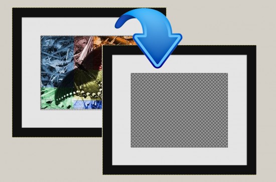
I opened my own photograph as a new image, copied the part of it that I wanted, and pasted it as a new layer on top of the frame — then I moved the new layer with my photo in it down, so that I could look at it through the hole in Linda Kellie’s frame.
I could now move around the photo while it was under the frame — as if I actually had a photo in physical frame and was sliding it around in there. I could also shrink it or fix the color balance or do anything else to it, without affecting the frame itself.
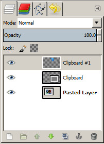
To move a layer down, go to Layers -> Stack -> Lower Layer. Or you can go to the Layers Toolbox and move the layers around right there.
You can also use the Layers Toolbox to make a layer temporarily invisible, which can make it easier to work on lower layers. And you can also set the transparency of layers, which can be handy for superimposing on image on top of another.
The Layers Toolbox pictured at left is from when I made the previous image — the bottom layer is the framed picture of the butterfly, the middle layer is the same image but with the butterfly picture cut out, and the top layer is the blue arrow, which I got from a clipart site.
To move a layer up or down, just click and draft it, or click on it and use the little up and down arrows at the bottom of the toolbox. Clicking on the eyeball in front of layer make the layer go invisible.
It’s important to know what layer you’re dealing with because you can only select and move things around, or draw on, the active layer. So, if, say, the active layer is the bottom one, then you can’t erase part of the blue arrow that’s in the top layer. This is a great feature — it means you can edit one part of a picture without worrying about spilling over into another part. But it also explains why many of my previous attempts to edit things in GIMP ended in disaster — since I didn’t know about layers, I didn’t keep an eye on which layer was active.
3. A different kind of frame
Another thing I learned from The Book of GIMP is some of the cool things you can do with filters.
And I learned why my previous random experimenting with filters often ended badly — it was because I had the wrong layer selected, so while I thought I was filtering one thing, I was filtering something totally different.
One kind of GIMP filter adds a frame around a picture.
Just go to Filter -> Decor -> Border and pick the frame size, color, and delta value on color. The last one is the degree by which the color on the frame changes.
Now you should have at least two layers — the photo layer, and the layer with the frame in it. Make sure that it’s the frame layer that’s selected, and you can make it 3D.
Go to Filter -> Decor -> Bevel. I picked the largest value possible for the bevel, and actually ran this filter twice, to create a really nice frame effect.
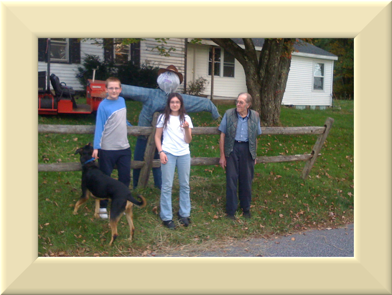
You can do this in multiple steps, to add some white mat borders between the photograph and the frame.
To create an off-white mat, I started over with the original picture.
Then, I clicked on Filter -> Decor -> Border again, but this time using a color closer to white and zero for the “delta value” of the color. But the mat now looked too smooth — like it was made of copy paper, not a nice expensive canvas-like cardboard. Here, another filter came in handy.
Making sure I had the border layer selected — which it still was, since I had just created it — I clicked on Filter -> Artistic -> Apply Canvas. Then I created a second border and beveled it, and the results looked really nice and professional.
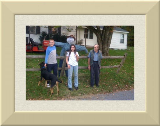
Perfect for pasting onto a prim surface and putting it on my virtual bookshelf in my virtual office. It looks like a real person made that texture, instead of me.
4. Creating textures from scratch
I’ve previously written about my attempts to create seamless, tileable textures by going outside and taking pictures of things.
It turns out that I could have skipped the tedious part of going outside and getting all that pesky exercise, just by staying home with GIMP and using it’s built-in texture creation tools.
Chapter four of The Book of GIMP is all about creating textures. Filters ->Noise -> Hurl creates a nice concrete texture, which, through a quick combination of other filters, can become stone tiles, or worn leather.
I’ve already used the canvas filter before. GIMP can also be used to create silk, metal, wood, water, and stone. Best part of making textures this way is you don’t have to drive around town looking for things — and you don’t have to worry about getting the right light conditions. Plus, since you’re making them from scratch, you have total control over colors, brightness, and other aspects of these textures.
Say, for example, wood. I’m always struggling to find just the right kind of wood texture that is guaranteed not to violate anyone’s copyright.
So I tried to make some of the things illustrated in the book, but I think my brain has maxed out for tonight. All kinds of textures were coming up for me, but not in any predictable or reproducible way. I have a feeling I need to re-read this chapter to see if I’m missing any key parts. In particular, there is a tantalizing section on using blending and blur effects to create curved wood textures, but I was only able to get a gray scale version. But, in the process, I discovered a whole set of dialogs and tools that I did not know existed, including a whole collection of pre-made textures.
For someone like me, each step has to be spelled out explicitly so that I can follow along. When the book says, “use the Blend tool,” I don’t know what that means. What Blend tool? Where? Okay, I finally found it. It was in the Tools menu. But I still don’t know what it is. It’s not like the Blur effect, where you click okay, and everything goes blurry.
So readers might be advised to read carefully, and not to skip ahead.
Another difficulty I had with the book is that sometimes the before and after pictures looked too much alike, and I couldn’t see what they were doing. On the other hand, I might just need glasses.
Would I buy this book if I didn’t get a free review copy? Not at $50, the original cover price. But Amazon is currently offering it at almost half off and, having spent time with it, that seems like a fair price.
I haven’t read any other books on GIMP to compare this one with, but, overall, I found it to be clear and very thorough. The items I mentioned above aren’t the only things I’ve already learned from the book. The selection techniques, in particular, have already come in handy.
Next, I’m going to how to do the blending, and I’m thinking of looking ahead to the chapter on masks, just to see what that’s all about.
- OSgrid wiping its database on March 21: You have five weeks to save your stuff - February 15, 2025
- OpenSim activity up with the new year - January 15, 2025
- OpenSim land area, active users up for the holidays - December 15, 2024
