The most important thing to know about Cloud Party is that it’s a Facebook app. Yes, they have their own website, but the only thing on that website is a link to their Facebook app. Which, considering all the bad buzz going around about Facebook apps right now, was almost enough to make me pass up writing this review. However, as you can see, I decided to just deal with it. There is an anonymous log in available, but it takes away a lot of user privileges, like building and buying land.
Now, logging in with Facebook does make things a lot simpler, since you don’t have to create a new account, but it immediately limits the app to social settings only. After all, you don’t send business emails through Facebook , so why would you have a business meeting through Facebook ? Still, if you’re looking for a social hang out, then it’s great, because your friends already have accounts, you just have to invite them to use the app. Having a virtual world on Facebook seems like a logical continuation of the whole social media trend.
Cloud Party had a very quick load time.
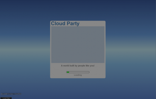
Thankfully there’s a mute button underneath the menu, because the app keeps making weird noises which are way too loud considering my sound is set to almost nothing.
There are two options for an avatar, male and female, but they look halfway decent. The app also gives you an option between a tablet style control, where you drag the camera around, and a PC video game style control, where the camera follows the mouse. I chose the PC style control, but it seems to have given me the tablet one anyway. Or they’re not as different as I thought they were.
Moving around
There’s two different tutorials available when it loads. The Getting Started one offers extremely simple instructions, such as click here to move. Which, as I had already figured out, led me to close the tutorial which closed both tutorials instead, so I guess I have to figure out building on my own. Here’s a tip: don’t close the tutorial box unless you actually know what  you’re doing.
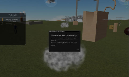
Still, the controls are pretty easy to figure out. There’s a button in the top right corner that looks like an iPhone, that, when you click on it, opens up a menu that looks pretty much like the home screen of an iPhone except with their options as apps instead of Angry Birds or whatever people have installed.
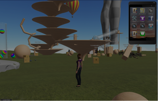
Weird chat windows keep popping up and obscuring the screen. It’s distracting, but I think if I were actually talking to someone I would appreciate it. There’s also a local chat box, located in the same place as in the OpenSim and Second Life viewers, which I like because I already knew what to expect.
Anyway, the smartphone menu thing has a bunch of different options, including some weird ones like Goals and Facebook. Why is there a Facebook button? It’s already on Facebook. There’s Facebook buttons all over the page. Goals thankfully brings the tutorial back up (although now that I’ve gotten this far I’m starting to feel like I don’t really need a tutorial). I still have to get through the Getting Started tutorial in order to get to the Building tutorial though, so I’ll see if I can figure it out on my own first.
When you actually do go through the tutorial, it forces you to do all sorts of annoying things, like actually use the chat box and teleport to another world. And, of course, you can’t get to the building tutorial until you go through the first tutorial about getting around. The tutorial is very helpful if you’re an absolute newbie, but if you’re not, then it’s just annoying.
It turns out the Facebook button allows you to post things to your wall and invite friends and such. Which, okay, I guess makes a little sense. I’m still annoyed that it’s a Facebook app, and I’m trying very hard to find things wrong with it, but so far it seems to be very well designed. Except for the annoying tutorial.
Moving around in world is very easy, you just click on where you want to go. It’s a little slow, but so far it hasn’t crashed my browser so that’s promising.
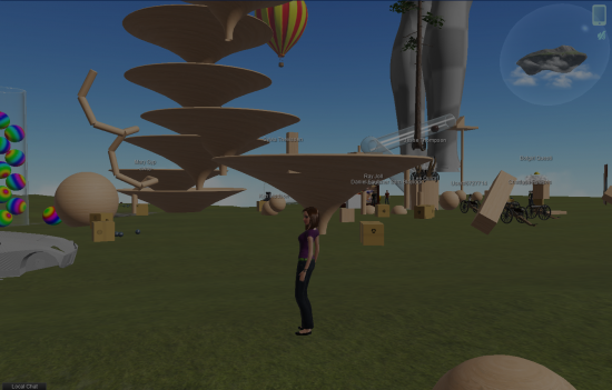
There’s a bunch of weird things off in the distance, a soccer ball, a floating minigolf island, and a bunch of weird wood things. Also a weird giant female mannequin thing I just noticed. The graphics seem to be about on par with OpenSim and Second Life, and I think it might even a little faster.
Travelling between worlds
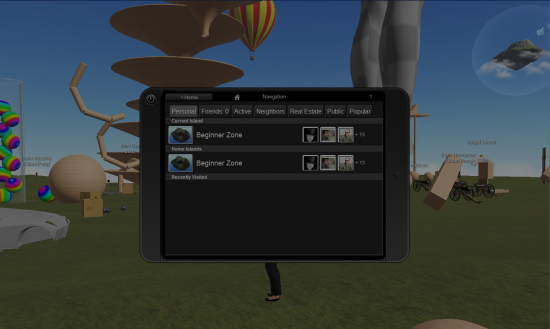
The Navigation button in the menu (which looks like the Map app button on your iPhone) opens up to your recently visited worlds, your home world, and the current island you’re on. There’s a bunch of tabs which offer various lists of other islands around, as well as a reminder that I have no friends in the form of a list of your friends’ homes. Which is one of the biggest things I hate about social media: a complete and utter lack of privacy. Basically, the only way to not broadcast your home selection to everyone else is to have no friends, which completely defeats the purpose of having friends anyway. But I suppose as long as you don’t set your home to something embarrassing like XtremePorn3000 (which I haven’t seen yet, but give it time) then it doesn’t matter.
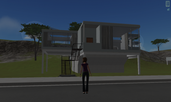
Also, if you’re a feminist, I just noticed that the default female avatar is Hollywood-thin, so if you love enforcing unhealthy gender stereotypes then the default avatar is perfect for you. However, there is an Outfits option in the menu, so if you want to change the color of anything then go for it. However, if you want to change anything else, then too bad because you only have one option. Still, even though you can’t change them, things like body type and face shape show up in the menu, so hopefully there will be options for that in the future. Cloud Party is still in beta, so there’s hope yet.
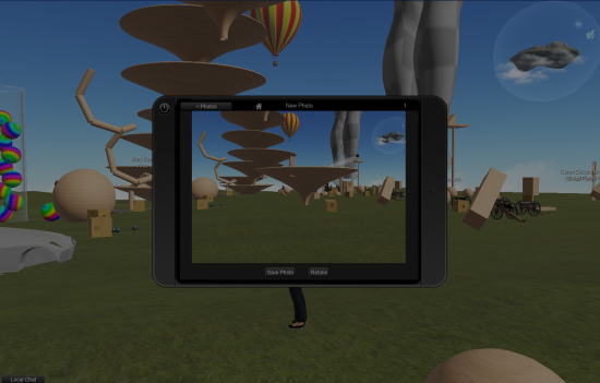
There’s also a camera feature, where you can take pictures of stuff in world. Unfortunately, you can’t save photos to your computer, only to a Facebook album. Still, you can browse through your photos from a handy Photos option in the menu, so you can… Er… Look back at your photos later. And there are ways to download photos from a Facebook album, so it’s not like the photos exist only on Facebook  forever, although it takes a couple steps to get there.
Building things
And now to the exciting part: building. There is a handy Building option in the menu. Clicking on it makes the entire world go hexagonal and wavy, and your avatar disappears into a cloud of dust wearing a hard hat. There’s a library of some basic shapes, and, for some reason, a cannon and a soccer ball. Choosing an object lets you place it, but your only options for placing seem to be close up and half in the ground, or far away and in the air.
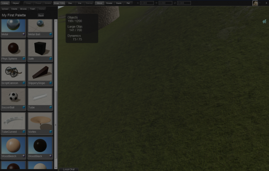
Building in Cloud Party is very similar to building in OpenSim, so if you’ve built anything in OpenSim then it should be a snap to learn how to build in Cloud Party. So far it doesn’t seem like you’re able to upload your own textures, but hopefully that’s a feature they will be adding shortly. In the mean time, there is a texture library available, although it either doesn’t work for me or is completely empty. Still, there’s hope for the future.
The building tutorial is very basic, and is no help at all if you want to start designing objects, but completing it does give you access to some new objects, as well as giving you the option to buy a home.
Obviously, Cloud Party is not a high powered design tool for creating vast worlds for your fantasy game, or chic state-of-the-art meeting facilities. However, if you want a nice place to hang out with some friends, then Cloud Party is perfect.
The fact that it’s online and requires no download puts it way ahead of Second Life or OpenSim for casual hangouts, and the fact that it uses Facebook makes it very easy to introduce virtual worlds to people.
- Firestorm opens office in OSGrid - October 17, 2012
- 5 ways to use achievements for viral marketing - September 12, 2012
- Cloud Party is a social platform, not a business venue - June 21, 2012
